Friday, February 17, 2012

Concept ships by Fabián J. Cuevas

Concept ships by Fabián J. Cuevas: More of Fabián's concept art on fabelab.blogspot.com


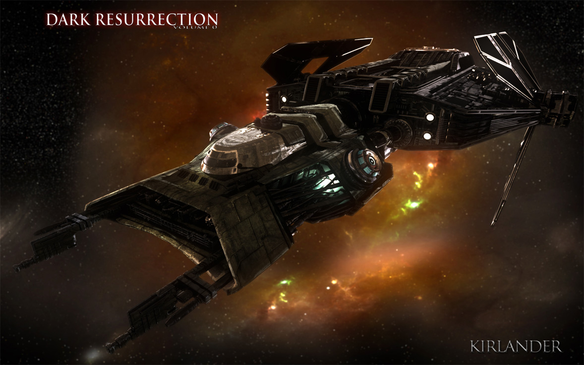
Keywords: concept science fiction futuristic illustrations by fabián j cuevas from mexico city attending algonquin college ottawa ontario canada

Starship Enterprise concept by Shawn Weixelman

Starship Enterprise concept by Shawn Weixelman: An entry for the Design the Next Enterprise contest by Shawn Weixelman.


Keywords: cryptic studio design the next enterprise contest star trek online game entry by shawn weixelman

Thursday, February 16, 2012

The 80/20 Rule

The 80/20 Rule: I've often heard artists, designers, management, etc. use "the 80/20 rule" to explain their choices.

"You want 80% to be rest areas and 20% areas of detail"
"80% of this geometry should be interactive and 20% non-interactive"
"As long as we get it 80% right, the extra 20% doesn't matter"

The problem is, none of these things have anything to do with the 80/20 rule.  So let's get it right, because this is an important one if you want be a faster artist.
The 80/20 rule states that 80% of a system will be affected by 20% of the variables in it.  So that 20% matters a lot.  80/20 doesn't mean that everything divides neatly into that ratio, or that that 80% should be one thing and 20% should be another.  Instead, it's a principle of resource allocation.

So as an artist, what is that 20% of your process that takes 80% of your time or resources?  There are multiple answers to this question.  Here are some ways it applies to me:
How often do you get a painting to the point where it's looking good and you start feeling like you're just about done, only then you spend way more time finishing the painting up than you did getting it to that point?  For me, this is true nearly every time.  If you paint in detail or care about your brush strokes, this is just a fact of life.
But to make use of the 80/20 rule, you need to do more than identify the problematic 20%. It may be useful for setting proper expectations, but you won't get any faster to know that.

Where the 80/20 rule becomes useful in this case is by applying it in another related area.  If I were to uniformly apply detail across this painting once I finished the block-in, it would have taken me three times as long.  So instead, once I got to hour 3 or 4, I tried to identify the 20% of the painting that would likely demand 80% of a viewer's attention.  Then I focused a disproportionate amount of time and effort developing those areas. The remaining 80% of the painting then fell naturally together in support of the high-attention areas.  This is the magic of the 80/20 rule: tackle the correct 20%, and the other 80% often falls into place.

What are some ways that the 80/20 rule could be used to speed up your process?

Wednesday, February 15, 2012

MONTHLY HEADER #77: Dark Resurrection vol. 0

MONTHLY HEADER #77: Dark Resurrection vol. 0: I've bumped up Dark Resurrection vol. 0 to headline February. A 41 minute Italian Star Wars homage with amazing attention to detail from acting to wardrobe to visual effects, it rivals a lot of Hollywood sci-fi production concepts. From a dedicated group of individuals for sure. Thanks for the clips Angelo!

Check out these renders of the Kirlander. Modelling: Riccardo Gallino, Texturing: Mirco Paolini, Lighting & Compositing Angelo Licata.


Keywords: italian star wars fan film dark resurrection vol. 0. high definition kirlander spaceship renders hd flash animations sci-fi science fiction visual effects movie custom wardrobe italian cast english subtitles

The Art of Freelancing

The Art of Freelancing:

Today I have an incredibly exciting announcement: I’m releasing an extensive 5-hour downloadable lecture on all things freelancing—portfolio building, branding, marketing, finding art directors, and so, so much more.


I’ve been putting my heart and soul into making this thing as useful as I possibly can for new and hopeful freelancers. I wanted to make something that I would’ve killed to have when I was just starting out. And I think I have. You can check out the first 30 minutes right here:


To learn more (and listen to the full 5 hour lecture), head on over to TheArtOfFreelancing.com


Kurt Wenner’s 3D Wonderlands

Kurt Wenner’s 3D Wonderlands:

We’ve featured the work of Kurt Wenner before, but not nearly enough given the amazing talent of the artist. In fact, in many cases, Wenner’s art appears to be even more realistic than many of the other 3D chalk artists we feature because he frequently opts to include a back wall into his works, giving them even more dimension. Take this installation at the Waterloo Station in London, for example. Sure the man on his couch watching television has a lot of depth, but by adding a truck full of 3D animals crashing through the wall, it’s easy to feel just as shocked as the man in the artwork.


Here’s another example incorporating a back wall to the artwork. Sure he could have stretched the piece over a long space of sidewalk to play with our perception, but by creating this ad for Celebrity Cruises with a back wall, the drawing looks right no mater what angle you view it from.


Of course, he doesn’t incorporate backdrops into artworks that don’t need them. In fact, adding a background to this reflecting pool illusion might actually distract from the amazing likeness of the actors portrayed in the sidewalk.


If you need further proof that Wenner is certainly one of the masters of his craft, consider the fact that he was the first 3D chalk artist to conceive of an interactive chalk drawing as seen in this photograph from 1987.


Zip-lining across a city street can be fun, but it’s nothing compared to flying across wild terrain. For those that don’t have the time or money to get away from it all though, Wenner offers a grand compromise with this gorgeous canyon advertising the beauty of wild British Columbia.


For more great works by Kurt Warner, don’t miss this piece in the Telegraph, or just visit his website.


Creative paper sculptures by Calvin Nicholls

Creative paper sculptures by Calvin Nicholls:

Canadian artist Calvin Nicholls creates the following amazingly beautiful sculptures using sheets of paper. Calvin has been creating his paper sculptures since 1986 from his studio north of Toronto Ontario, Canada. Working with sheets of paper and a scalpel, he cuts the component pieces to fit the final drawing and assembles the low relief artwork under studio lighting. When the sculpture is complete the lighting is adjusted to bring out the subtle form and texture. A large format camera is used to capture the detail on 8×10 film prior to scanning for print applications or art prints.


See more

Produce crate labels

Produce crate labels:


Before the austerity imposed by World War II, produce in the US was shipped in wooden crates with colorful, carefully designed and illustrated labels, meant to set each producer apart from the others.


The relatively sudden advent of cheaper cardboard boxes left many of the crate labels unused and they have become collectors items.


A recent post on MetaFilter has pointed out several sources for images of some of the labels, and other sources of information about the market for them as collectables.


The Boston Public Library’s Flickr set has the best and largest images, along with the Los Angeles Public Library.


There are more, with smaller images, on BlueSkySearch. The Crate Label Museum is most extensive, though the images are unfortunately small (note the dropdown at lower right to select categories, and note that many categories go on for several numbered pages).

Awesome 3D Chalk Arts

Awesome 3D Chalk Arts:


See more

Spaceships of EVE viewer

Spaceships of EVE viewer: Check out this new spaceship viewer that the CCP crew have developed. Make sure you expand it to fill the whole screen before you rotate them. Super clean.


Keywords: eve online interactive spaceship viewer online web development by ccp

Neolithic Scene

Neolithic Scene:
Sometimes a picture idea gets aborted after a lot of work. That happened with a picture I developed 25 years ago for National Geographic. 


The idea was to show Neolithic humans in their first domestication of sheep. This was to be for an article on wool. The archaeological evidence seemed to point toward a scenario where mouflon sheep were captured, penned in, and controlled.


After doing many thumbnail sketches, the art director and I agreed on a scene where two men are restraining a ram while the ewes are released from a cave. I made a little clay maquette of the scene (photo, inset) to work out the lighting, and then did a charcoal drawing of the light and dark masses.


Then I hired models come into the studio and had them pose for charcoal studies. I wanted to use the really old-school method of working from studies rather than photography. I also went to the Bronx zoo to do sketches of mouflon sheep.


The next step was to work up the scene in color. I was getting excited by the opportunities with lighting. The view expanded outward to show more of their camp, a kid with a lamb, some hunting trophies, and the far landscape vista.


But wait! The archaeologist and the magazine art staff had additional ideas. How about a dog, and an old man? Maybe we could show more of the fence and how it was made. I kept redrawing it.


Eventually the picture lost momentum. I think we all became conscious that this one picture was trying to accomplish too much. There were too many ideas in it. As Howard Pyle said, it is essential that a picture express just one idea. "If in making a picture you introduce two ideas,  you weaken it by half—if three, it weakens by compound ratio—if four, the picture will be really too weak to consider at all and the human interest would be entirely lost."


If I just showed two guys wrestling a ram, that might have made a great picture. That simplicity is what makes Leon Bonnat's painting of Samson wrestling the lion really memorable.


Also, the editorial focus of the article changed, the layout space shrunk, and we decided to go with a completely different picture, showing the range of wool-bearing animals. National Geographic was a good client, and they paid me for the time I put into it.


Even though every picture is a labor of love, and you put everything into it, one has to be philosophical when this happens. This kind of abandoned work is fairly common when you work for clients that must balance a lot of different considerations, or that have a lot of decision-makers, or that are working with large financial stakes. Anyone who works in movie concept art and theme park design has similar stories.

--------

Check out the new book on Howard Pyle, with my article on his thinking and process.

The wool-bearing animal picture appears on page 36-37 of Imaginative Realism

Concept spaceship model by Joachim Sverd

Concept spaceship model by Joachim Sverd: Ship modelled by scifiwarships (Joachim Sverd) and rendered and photoshopped by Mike Mars.


Keywords: 3d model designed in Sketch up by joachim sverd and mike mars
tactical battledrone/UAV armed with massive particle cannon intended as a force multipier for capital warships of the solar battleforce
(earth in the 24century) flying main gun intended to support big warships combat by adding extra unmanned gun batteries