Saturday, November 5, 2011

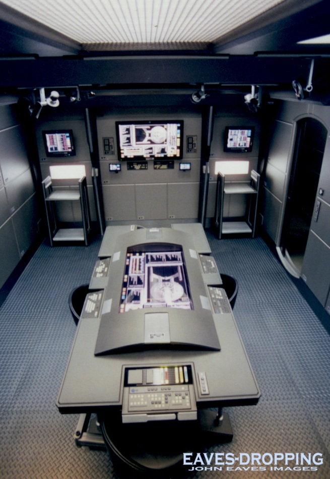
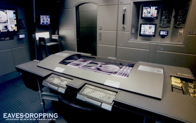
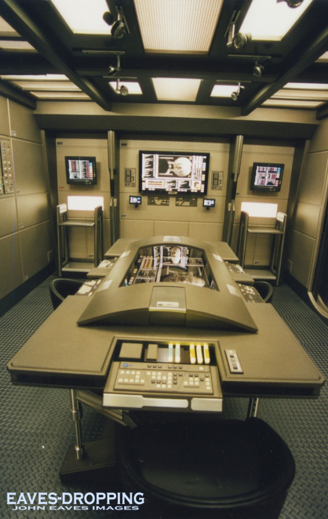
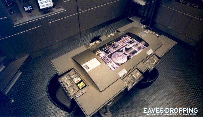
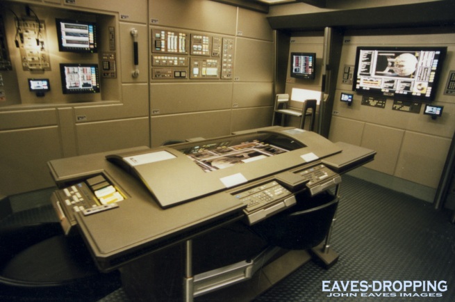
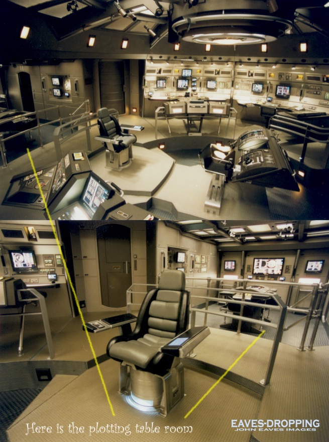
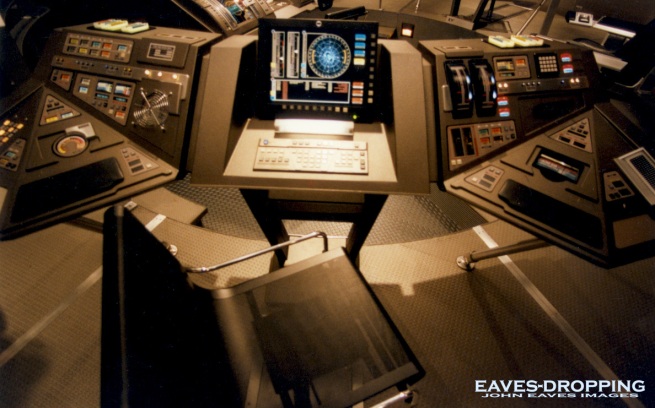
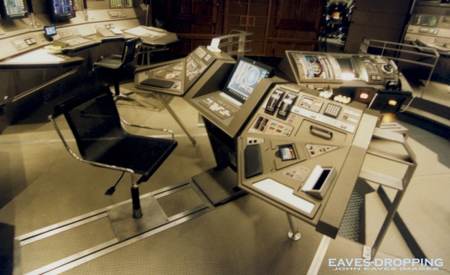
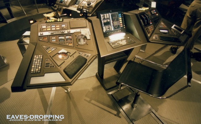
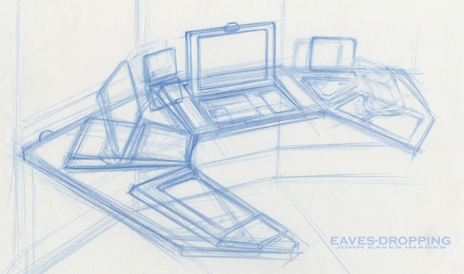
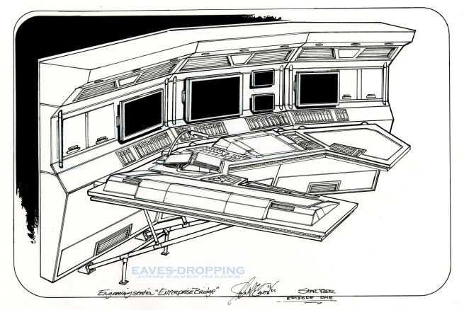
the plotting table from the bridge set of the nx-01

the plotting table from the bridge set of the nx-01:

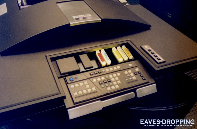
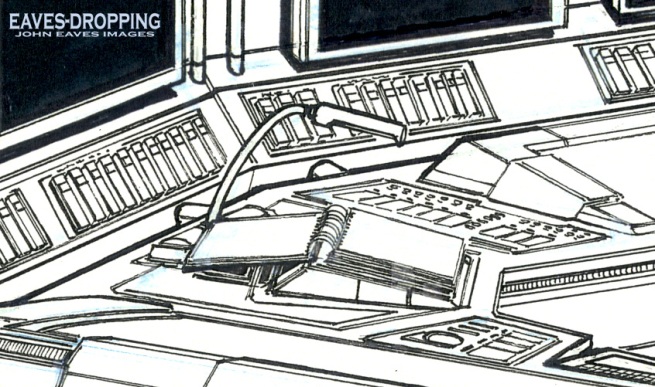
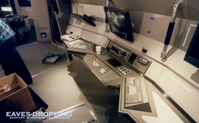
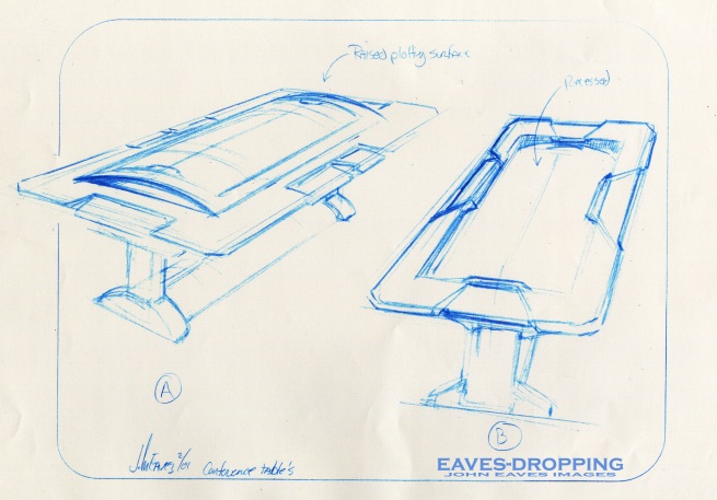
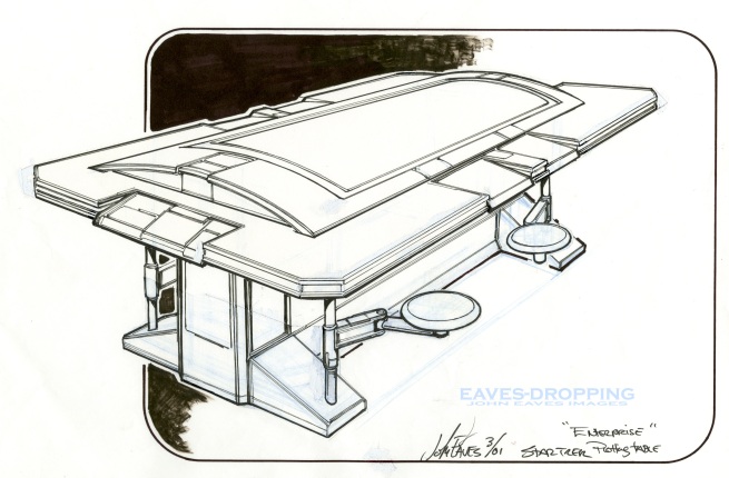
Here is the plotting table that was a really cool piece but had very little air time or interaction, I so wanted to take this home aftre the show,,, Come to think of it, I don’t recall whatever happened to this piece,,, HMMMMMMMM ’tis a mystery. Anyway, this was really a great project to work on and Herman just said: make us a nifty table to have meetings at!!! The early ideas were of the same layout except the rounded table top had plotting rules and sliding scales that would be able to move and plot across the entire surface. The curved surface would be made of milk plex and the images would be projected from underneath so it would act like a big hands on cartographer’s mapping system. This was axed to be instead a clear covering with a flat screen system under glass, and the sliding scales were thought of as too out of date. The end result was beautifully built by Tom Arp’s crew and stylishly detailed by Mike Okuda and Anthony Fredrickson!!!

roughs

roughs

and the final

and the final

looking from the back of Archers chair, this nook was two steps down from the bridge

looking from the back of Archers chair, this nook was two steps down from the bridge

side view

side view

lower view

lower view

high view, hese were in the early days and you'll see variations in the set lighting from warm to cool as they were trying to get the right look and feel with the lighting tones

high view, these pictures were taken in the early days and you'll see variations in the set lighting from warm to cool as they were trying to get the right look and feel with the lighting tones

opposite side view

opposite side view

details for Joe Ralet

details for Joe Ralat

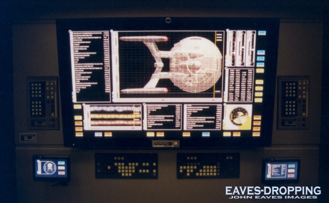
Mike and Jim's awesome work on the rear screen, this screen was in tandem to what was projected in the plotting table.

Mike and Jim's awesome work on the rear screen, this screen was in tandem to what was projected in the plotting table.

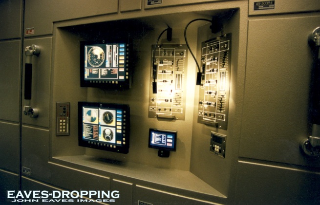
one of the inset wall panels

one of the inset wall panels

layout of the plotting room to the main bridge

layout of the plotting room to the main bridge

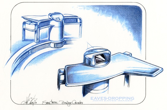
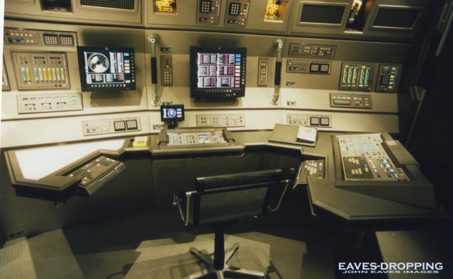
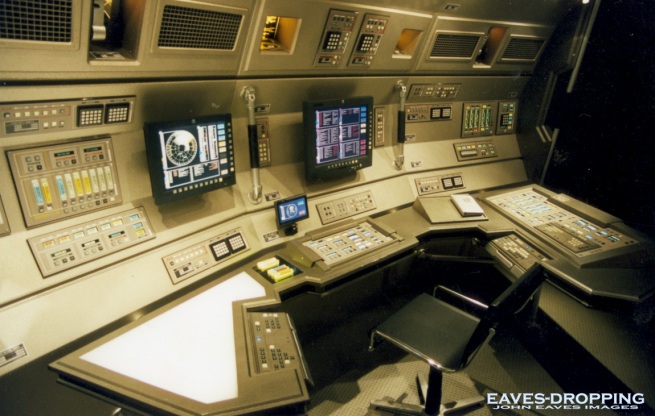
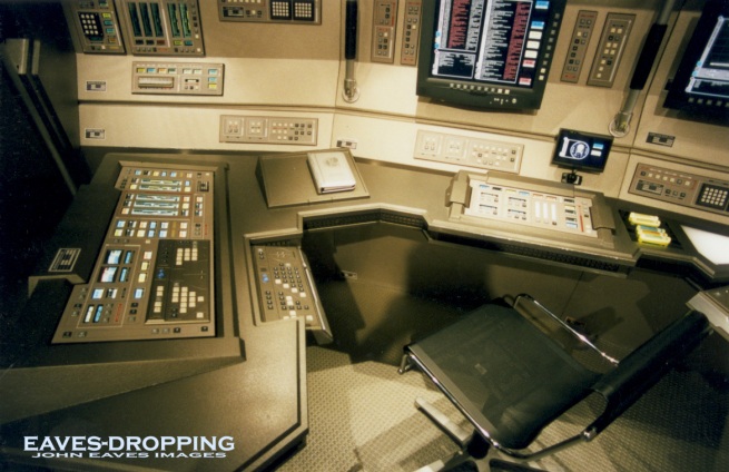
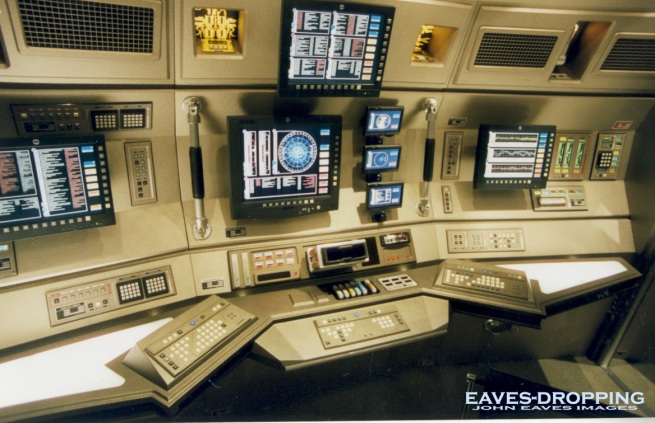
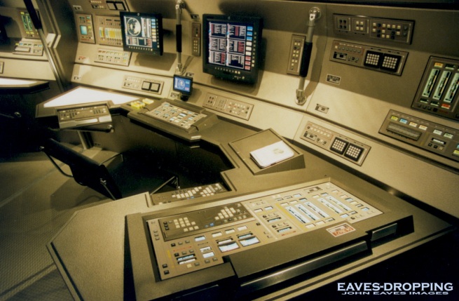
the stations and consoles of the NX-01 bridge

the stations and consoles of the NX-01 bridge:

Here are more from the bridge series. Doug’s beautiful exterior designs really made for exciting interior sets and compartments. Doug and Mike pushed for the Jefferies Tube set only to both get big fat punches in the face!!! NO Jefferies Tube on this ship!!!! They got their way when we had to recreate the TOS sets a few years down the line!!!

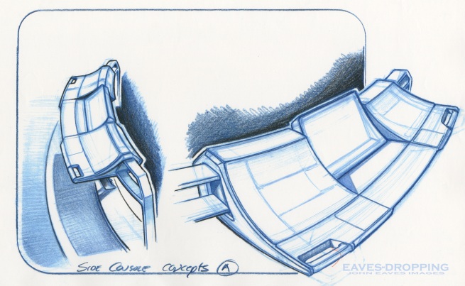
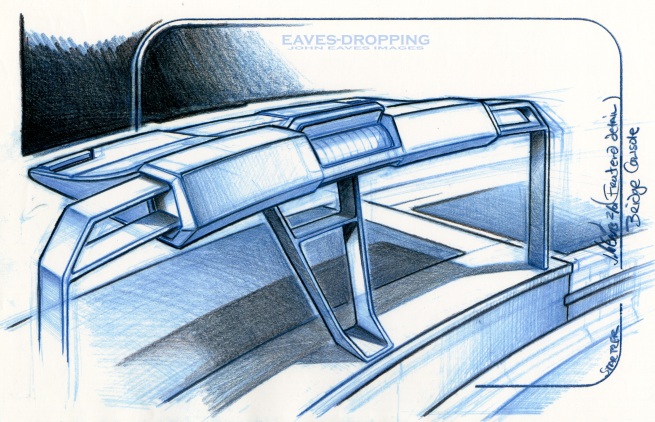
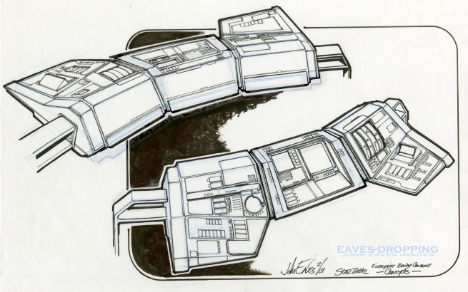
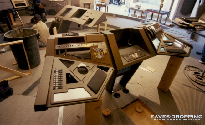
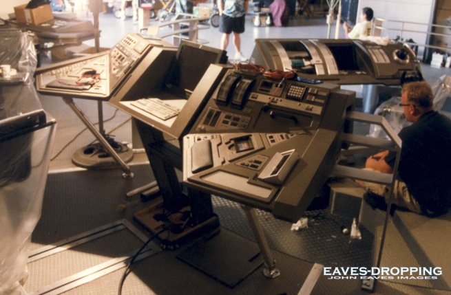
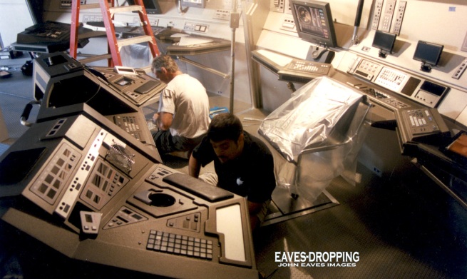
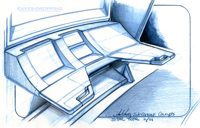
To follow up yesterday’s navigational station post, here are the drawings and concepts that led to the floating and side stations on the bridge set. Herman Zimmerman was quite the giddy one on this show, and he had the time of his life designing these sets. Having the history and experience of creating so many other bridges, he pulled all of his knowledge together to make his ST masterpiece sets. By applying the old philosophy of “If I had the chance to do it over again I would incorporate what I’ve learned from the past,” he designed this set in such a way that it was a very easy set to film in. Making the set full of wild walls and pull out panels and viewscreens, you could get the camera anywhere. In addition to that, he worked the filming lights into the set, so set-up time would be greatly reduced!!! He is truly a genius at this and he is one heck of a nice guy to boot.

Herman’s first order of business was to get the shapes and details of the consoles worked out. The bridge was going to be compact and circular based with two levels to work on. As you saw yesterday, there was the thought of a cylindrical base that the stations would be incorporated onto. At one point, the entire bridge was drawn up this way, and in the big picture of things looked awful. Seeing these drawings again, they seem very dated aesthetically. So from there we went with more angular ideas, and then finally a faceted version came about with a subtle wrap-around feel to the stations. The sliding chair idea really worked awesomely on the bridge so the crew could work on the wall stations, then swival and slide to the inward rail stations!!! Mike Okuda, Jim Van Over, Anthony Fredrickson, and the lovely Denise Okuda went to town on the graphics and animations. Mike’s eye for detail had no bounds here. Anthony filled all the holes with his greeblie mechanics, and Jim went berserk creating some incredible screens and animations!! Denise held everything together with a smile on her face and was always reciting some fun lines from Babe the Pig!!! With all that said, here are the art and images from the pilot sets of Enterprise…

angular and tubular don't mix!

getting better

getting better

almost there!

almost there!

and the final designs!

and the final designs!

1

1

2

2

3

3

4

4

5

5

5

6

rough wall station

rough wall station

rough 2

rough 2

and a final sketch

and a final sketch

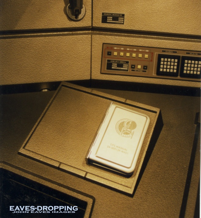
Mike and I had talked about how cool it was to see the operations manual on board the Space shuttle and at the stations of the Navy ships we had been on and thought it would be cool to have one at all the stations on the bridge. this is the spiral flip book version that later became Mike's hard bound text manual.

Mike and I had talked about how cool it was to see the operations manual on board the Space shuttle and at the stations of the Navy ships we had been on, and thought it would be cool to have one at all the stations on the bridge of the Enterprise as well. This is the spiral flip book version that later became Mike's hard bound text manual.

a

a

b, operations manual

b, operations manual

a right hand station, (Hoshi's )

a right hand station, (Hoshi's )

Hoshi's station new view

Hoshi's station new view

left handed station (Reed's)

forward left handed station

T'Pol's

T'Pol's

right handed

right handed

The Brainstormer is here!!!

The Brainstormer is here!!!:


Long Post Warning! If you want to go straight to the more cool parts, just find the link near the bottom of the post or go to the link on the sidebar under "Cool Tools". But you'll miss a good story, you know.

Hey all! It is finally finished! I wanted to share something that I've been working on for a long time. When I was in school at SJSU, studying visual development and illustration, I was always trying to give myself little concept projects to keep myself sharp and thinking. So I created a list of objects, persons, things, etc. and a list of styles, adjectives, etc. These very large lists were in the back of my very first Moleskine (an address book used as a sketchbook). The idea was to combine an object or person with a style or adjective (ex. Byzantine submarine or subterranean factory) to create unique and interesting combinations to concept out and illustrate.

I found it useful in it's crude form, but always wanted to turn it into a small, more sophisticated pinwheel format. Finally, a few months ago, during a lull in freelance work, I decided to make it happen. I inputted the lists into a free vector program called Inkscape. Designed a cover for it and called it the Brainstormer. I also added something new in this version: A story conflict list. I've spent a lot of time reading about stories and screenwriting since school and I recently found an interesting book called The Story Structure Architect. It broke down every plot idea into about 50-something different categories. I used this and narrowed it down to 45 for my Brainstormer. The point being to add greater depth to the combinations. Sometimes I would want to create an actual illustration from the designs I created for myself. But I needed a story if the illustration was going to be interesting. So this new ring of conflict ideas was a way of adding context to the concepts that came from the Brainstormer. When it was all designed and done, I had a nice paper version I could carry around in my current Moleskine sketchbook/journal. It looks just as shown above (minus the random button).

But when I showed it to some friends at work, they thought it might be cool to have a digital version of it. Obviously that would be very convenient for anyone who is on a computer all day. I had planned on posting the jpgs of each ring and cover so anyone could make their own without starting from scratch, but a digital one was even better. I didn't have the expertise or the programs to make that possible, but a good friend from work, John Michel, did. He was kind enough to offer his time to turn this idea into a Flash animation. We ironed out some quirks and John turned it into a really cool, animated, fully interactive program. He was also kind enough to store it on his site, until I finally make a site of my own.

I am posting it here for the first time and hoping that it's something others can benefit from.

The Brainstormer (click here)!

You'll notice when you play around with it that you have two ways of working with it. You can just use the random button in the middle, which will spin the wheels into different combinations. Or you can manually spin each wheel independently. I absolutely love what John has done with it! It's better than I could have ever imagined. Anyway, I hope that y'all will find it useful as well! Thanks for visiting!
Ilm VS Paramount/ Jeager battles eaves over the “E” escape pods

Ilm VS Paramount/ Jeager battles eaves over the “E” escape pods:

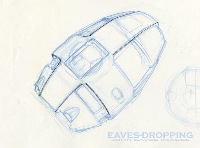
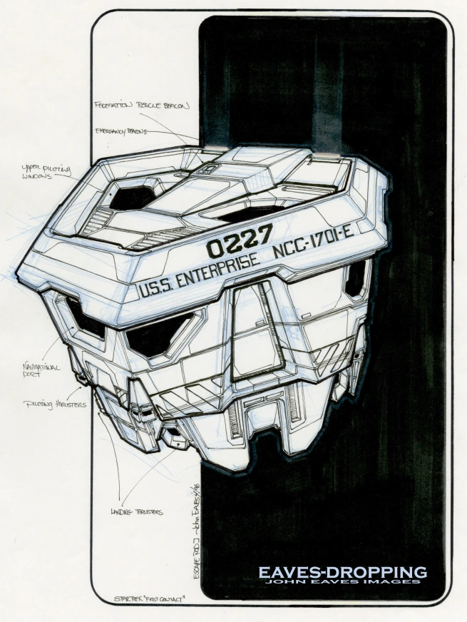
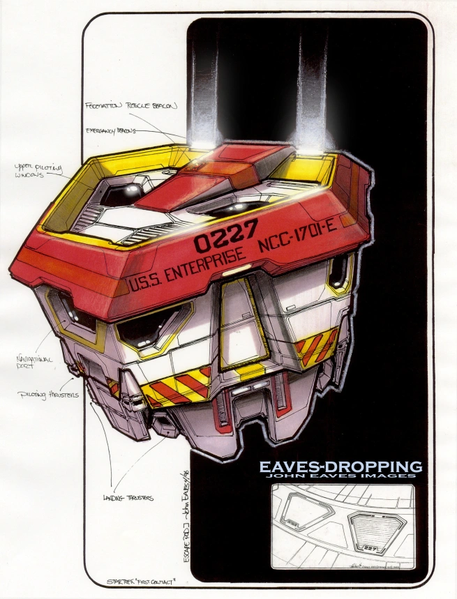
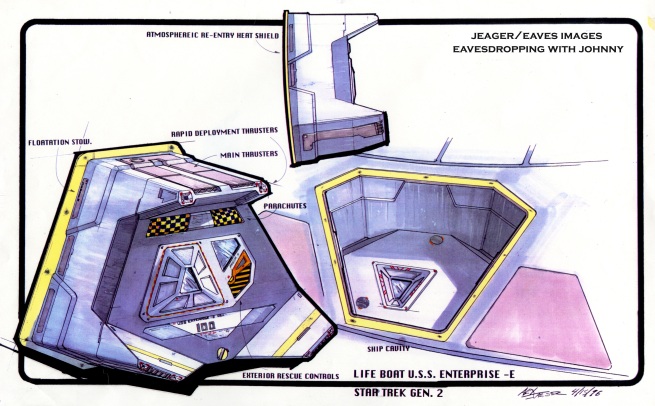
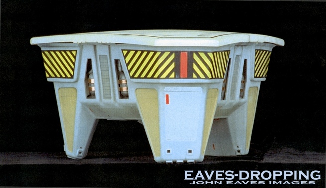
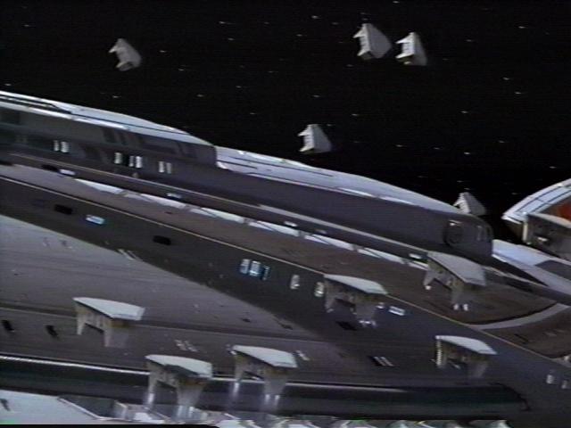
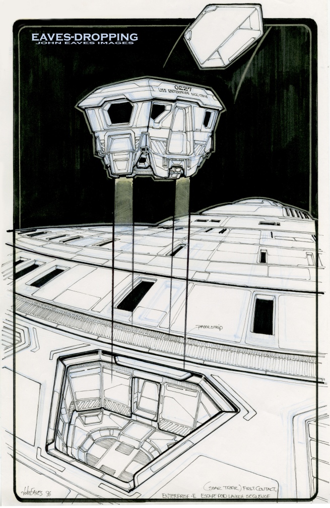
Here is episode #2 in the battle of the “ST, First Contact” art departments. The great Herman Zimmerman came to me and said we need to work out what these escape pods do and how they are launched for the VFX sequence. So I started drawing pods and and working out the mechanics of the launch system. the first sketch was of a grenade style pod that I passed on, and went for a more faceted look. from there a color rendering was done and a quick launch scene with an explosive hatch that would add some visual excitement when the pods ejected,,,, Meanwhile up at ILM Alex Jeager was doing the same thing for his boss Jeff Mann. The stuff Alex did went to the producers, got approved and a model was ordered to be built. the next day Herman took our stuff over and came back and said these are now considered art exercises, so back to the Vulcan ships for you. He laughed and told me the story!! We both laughed and and I was going up to ILM in a week or two and couldn’t wait to see what Alex had come up with,,,, Once there the model was pretty far along and was being constructed mainly from Vacu-formed pieces. wow this is looking cool and then saw the drawings Alex had done hanging on the wall. loved the cool simplicity he had designed and especially how he merged the exterior of the “E” to be a functional part of the pod!!! As always the amazing amount of fun on this film especially getting to work with my ILM heros will always be amongst my favorite Star Trek memories. here are the pod concepts and one shot of the finished ILM model!
grenade pass

grenade pass

sketch

sketch

color pass, 227 is my dad's HP badge #

color pass, 227 is my dad's HP badge #

3-2-1, blast-off!!!!

3-2-1, blast-off!!!!

awww!!! the brilliance of Alex Jeager

awww!!! the brilliance of Alex Jeager

one of Bill George's and John Goodson's handywork!

one of Bill George's and John Goodson's handywork!

wow what a shot and loved the Goldsmith theme that played out this scene!

wow what a shot and loved the Goldsmith theme that played out this scene!