Digest This: William A. Smith Illos from RDCB: Let's finish up this week with a look at two stories by the great William A. Smith.
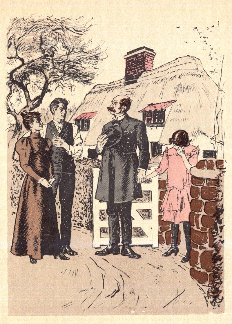
The first, once again from a 1960 volume of Reader's Digest Condensed Books, is painted in Smith's typically impressive style.
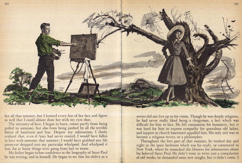
Whenever I look at Smith's work, Robert Fawcett comes to mind.
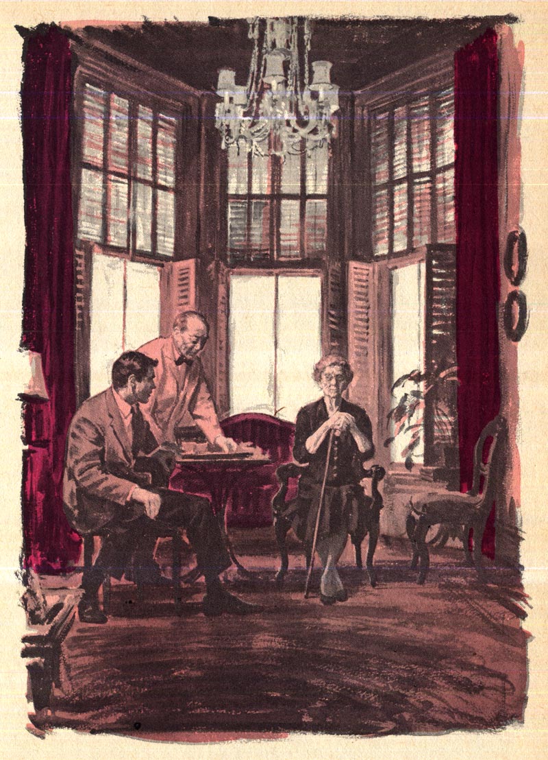
While Smith's work is far less structurally rigid than Fawcett's, they share a certain visual sensibility that has at it's root the discipline of classical art training.
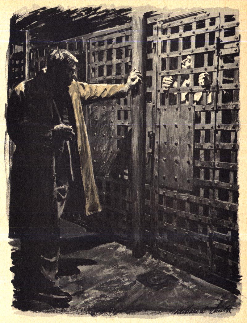
(Incidentally, William A. Smith's daughter, Kim tells me that her dad posed as the man in the trenchcoat for the reference photos he shot for this painting)
Not surprisingly, Smith and Fawcett were friends and had tremendous respect for each other's work. Charlie Allen once shared an amusing anecdote with me about these two men. You can read it at this link.
Also from 1960 (but from a different edition of RDCB) is this William A. Smith-illustrated story, except this time done in line with flat colours.
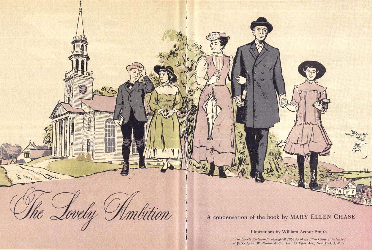
This is a relatively rare example of Smith's ink line style. Aside from his war reportage art, this may be the first time I've ever come across another example of WAS doing line art illustrations.
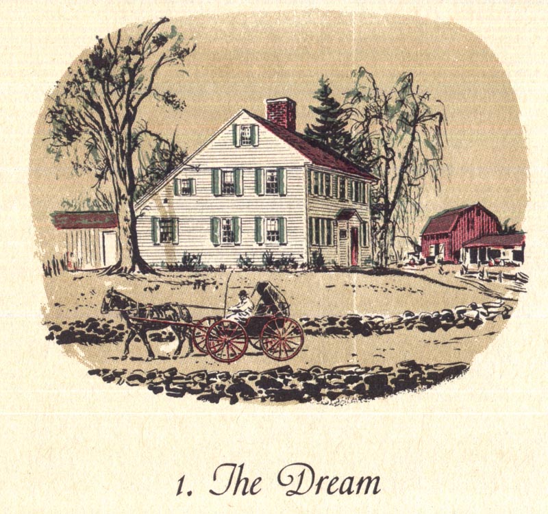
It goes without saying that they are of the same exceptional quality we see in Smith's painted work...
- but more than that, they offer a pleasant surprise...
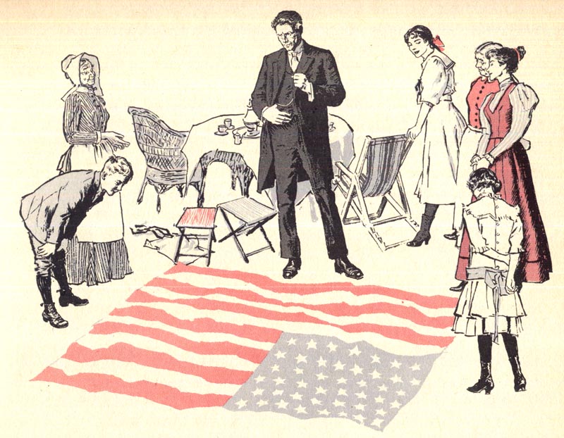
Smith shows us a touch of gentle humour in some of his linear interpretations - something not evident in his painted illustrations.
Maybe it's just me, but I see a little Robert McCloskey in William A. Smith's line art.
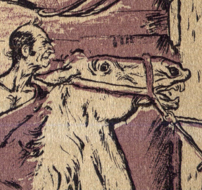
Kim Smith has vague memories of posing for this story when she was a child. Of modelling for her father's reference photos, Kim said, "Much of the time I hated it but was mostly a good sport."
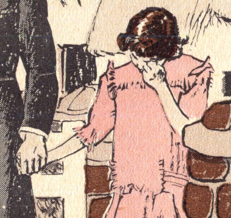
"Now I think it was an honor and so fun to see myself and my family playing various parts, like a play."
* Many thanks to Reader's Digest Creative Director, Robert Newman for linking this week's posts to the Reader's Digest art Tumblr page! Robert has been posting some classics from the back covers of Reader's Digest from those days on the RD tumblr page. Be sure to take a look!
This blog is the result of the end of shares in Google Reader. Shares go here from now on. Copyright is not mine, it's of the original posters, this site is only for reference for myself, so I can go back to what I shared before...
Tuesday, June 26, 2012
Howard Scott's Billboard Art
Howard Scott's Billboard Art:
Howard Scott (1902-1983) was the premiere designer of billboard art in mid-twentieth century America. He created campaigns for Esso gasoline, Schlitz beer, Nash automobiles, and Heinz ketchup.
In 1939, he said he wasn't threatened by the possibility that photographs might replace illustration on billboards:
Books: Forty illustrators and how they work
Illustrator in America, 1860-2000
Howard Scott (1902-1983) was the premiere designer of billboard art in mid-twentieth century America. He created campaigns for Esso gasoline, Schlitz beer, Nash automobiles, and Heinz ketchup.
His billboards usually had a clever line with a likable, homespun character against a plain background, not unlike Norman Rockwell's Saturday Evening Post covers, which he admired.
He went to great lengths to find the simplest composition. His gags had to come across at a glance to people driving by at high speed. "Give them a nimble-witted one-act play," he said, "convincingly characterized with complete realism if you want to stop the crowds on Main Street."
He worked in a neat Manhattan studio overlooking Rockefeller Plaza, and was known as a thorough professional. He chose to paint in gouache because it was more direct and it dried faster, an advantage for tight advertising deadlines. In addition to billboards, he also painted posters and magazine covers.
"The camera is out. And for good reasons. The camera reproduces the colors of the subject; the artist intensifies them, makes them more brilliant than they are in nature....Another thing. It's practically impossible to get models to act successfully for the camera....The artist can often be more dramatic by taking liberties with drawing. Figures may be shown in actually impossible positions to put over an idea that would stump the accurate camera. Sometimes anatomical distortions —not obvious to the observer—serve to make the action more legible or to give it greater emphasis."More on Howard Scott at Taraba Illustration
Books: Forty illustrators and how they work
Illustrator in America, 1860-2000
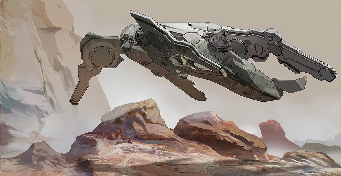
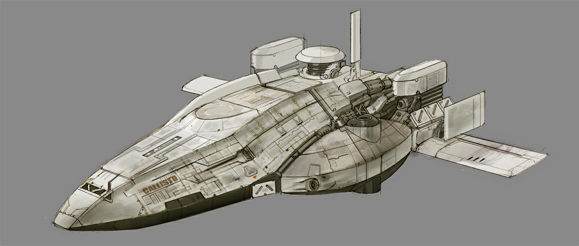
Carlo Arellano on Concept Ships
Carlo Arellano on Concept Ships: Fantastic ships from our friend Carlo Arellano. Check ROBOTS.
Keywords: heavy armored flying spaceship ship weapon concept futuristic sci-fi science fiction osprey art by carlo arellano chainsaw at blog
Subscribe to:
Posts (Atom)