Wow!!! What a fun time it was to be working on a new Enterprise bridge and especially for the beautiful NX-01. The internal sets of this ship went through some pretty radical changes as it evolved,, Herman Zimmerman would always start with the bridge to set the tone for the overall architecture and then branch out carrying the details through the corridors and secondary rooms, based on this master blueprint. In the eary stages the consoles were being designed in an angled, tubular fashion; these ideas went a ways before the look changed to a more angular look. Next the nav station went through a wrap around configuration tied to the ceiling of the bridge by a fine metal bracing system. Elements were chosen and some dropped to come up with the next series of ideas, and in this process did the half curved console layout come to be. The final designs came to be quite elegant in nature, and this station was my favorite of all them. The sliding seat idea came from touring the Disney Cruise ship bridge and funny thing a guy nammed Jon Eaves from Australia was the one that gave me the tour!!! HAAA! What a funky coincidence, and when boarding the ship my name gave the security a little bit of a high tension moment!!! Anyways, here are the evolutionary concepts and some photos from the finished set to complete the design cycle. I finally found all the pictures I took of these sets, and it has to number close to 2000 images,,,well, I guess we won’t run out of subjects on the blog here for a while,,, HAAAAAA!
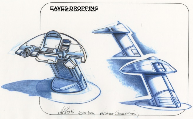
totally tubular dude!
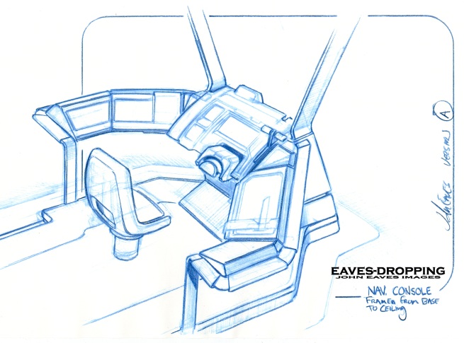
roof mount version #1
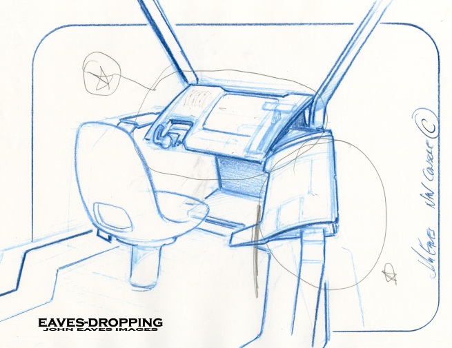
thined out version and in red are the pull outs of ideas to carry on to the next drawing.
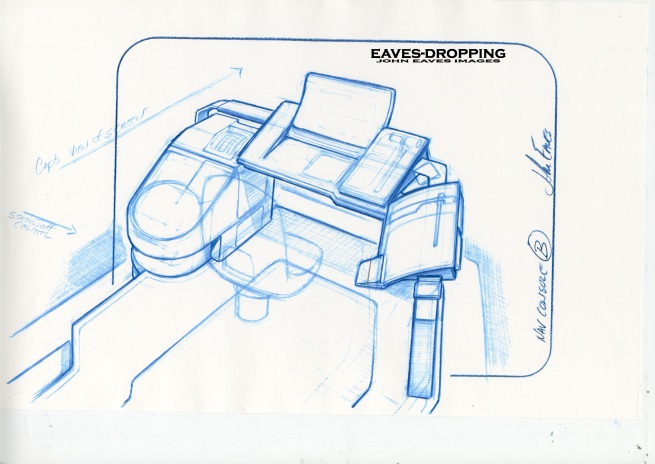
getting closer,, the curved screen started the idea for the curved console's
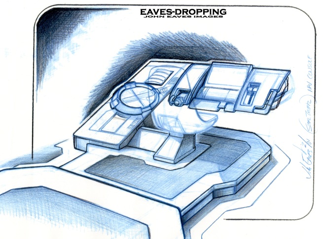
the boss is liking it!!!
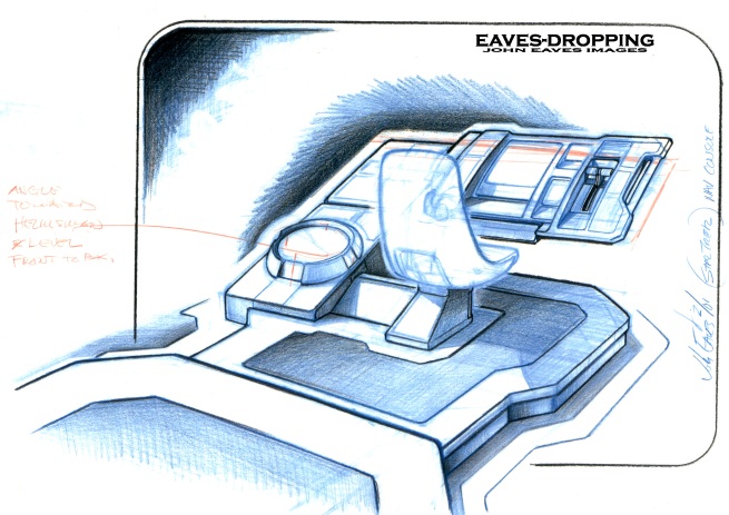
this is the rough that got the go ahead to be detailed out.
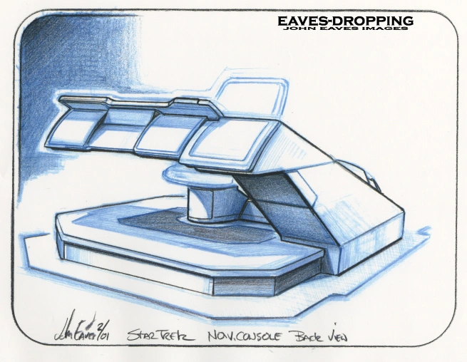
the rough back side!
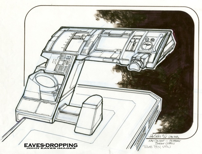
the final rough minus the sliding seat detail
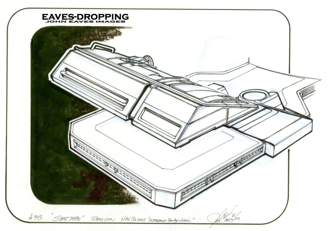
and the back view
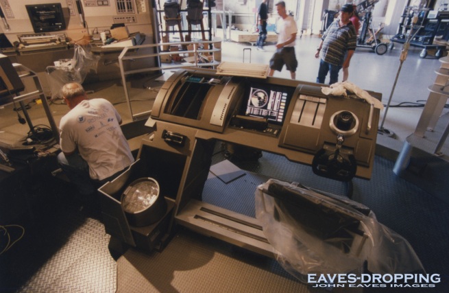
under construction
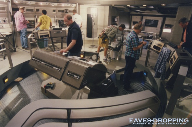
construction
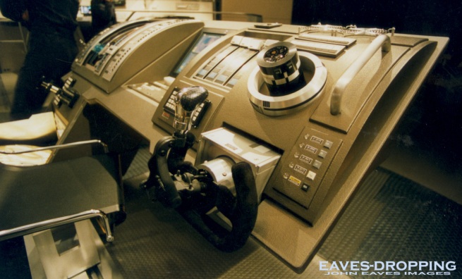
view 1
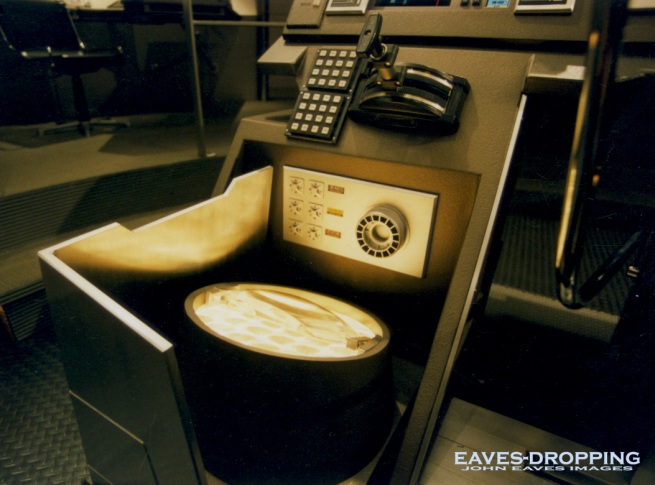
view 2
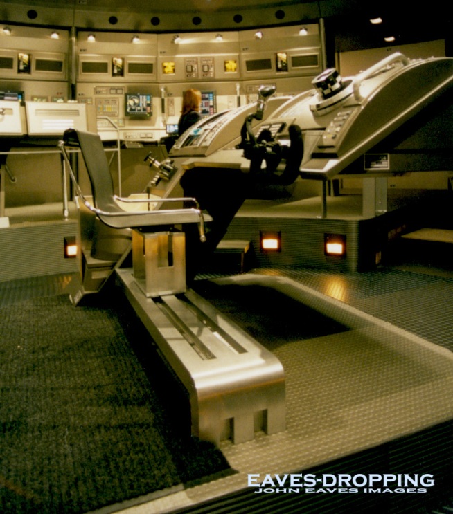
view 3
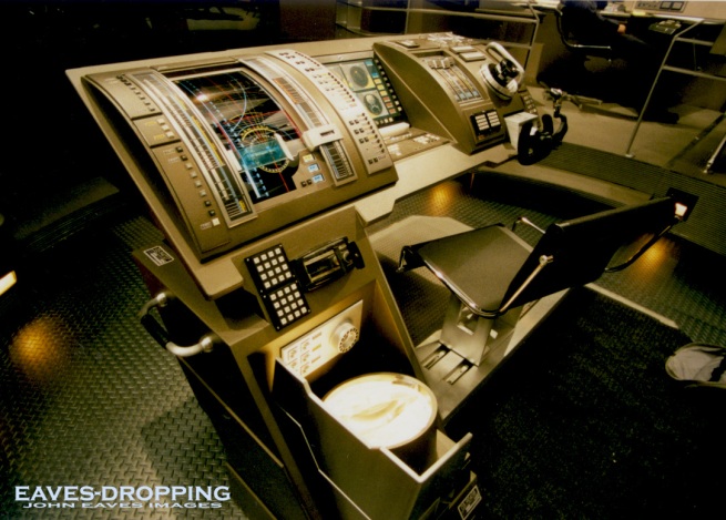
detail
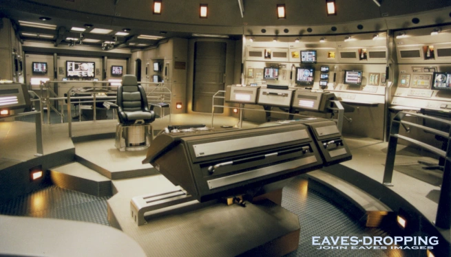
detail 2
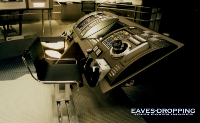
side

No comments:
Post a Comment