Here are more from the bridge series. Doug’s beautiful exterior designs really made for exciting interior sets and compartments. Doug and Mike pushed for the Jefferies Tube set only to both get big fat punches in the face!!! NO Jefferies Tube on this ship!!!! They got their way when we had to recreate the TOS sets a few years down the line!!!
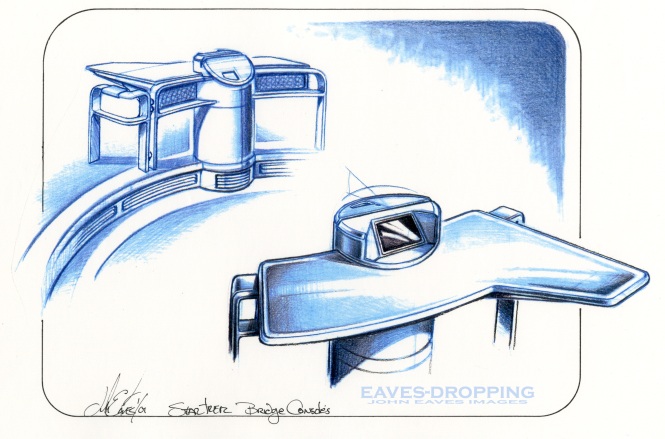
To follow up yesterday’s navigational station post, here are the drawings and concepts that led to the floating and side stations on the bridge set. Herman Zimmerman was quite the giddy one on this show, and he had the time of his life designing these sets. Having the history and experience of creating so many other bridges, he pulled all of his knowledge together to make his ST masterpiece sets. By applying the old philosophy of “If I had the chance to do it over again I would incorporate what I’ve learned from the past,” he designed this set in such a way that it was a very easy set to film in. Making the set full of wild walls and pull out panels and viewscreens, you could get the camera anywhere. In addition to that, he worked the filming lights into the set, so set-up time would be greatly reduced!!! He is truly a genius at this and he is one heck of a nice guy to boot.
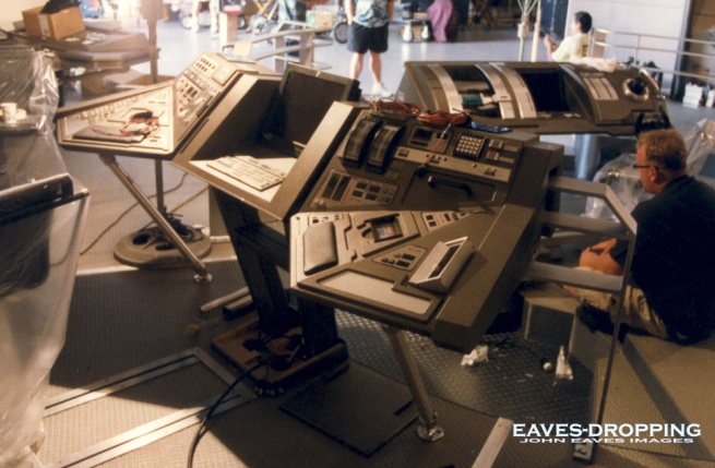
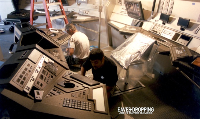
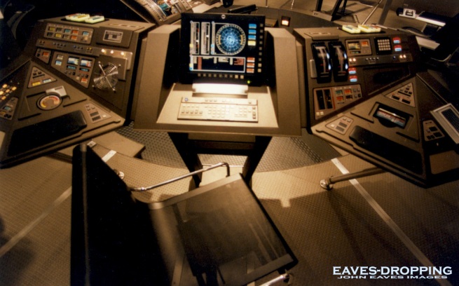
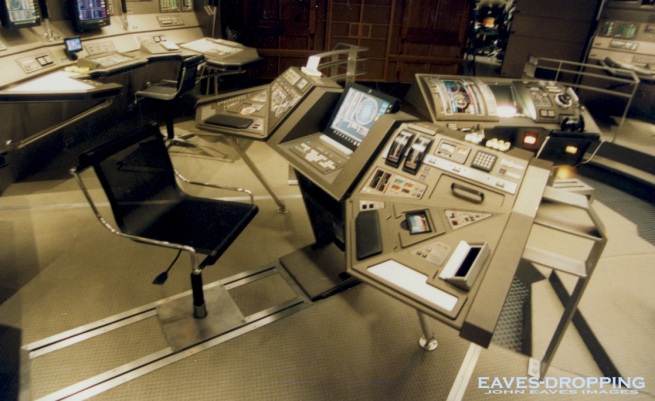
Herman’s first order of business was to get the shapes and details of the consoles worked out. The bridge was going to be compact and circular based with two levels to work on. As you saw yesterday, there was the thought of a cylindrical base that the stations would be incorporated onto. At one point, the entire bridge was drawn up this way, and in the big picture of things looked awful. Seeing these drawings again, they seem very dated aesthetically. So from there we went with more angular ideas, and then finally a faceted version came about with a subtle wrap-around feel to the stations. The sliding chair idea really worked awesomely on the bridge so the crew could work on the wall stations, then swival and slide to the inward rail stations!!! Mike Okuda, Jim Van Over, Anthony Fredrickson, and the lovely Denise Okuda went to town on the graphics and animations. Mike’s eye for detail had no bounds here. Anthony filled all the holes with his greeblie mechanics, and Jim went berserk creating some incredible screens and animations!! Denise held everything together with a smile on her face and was always reciting some fun lines from Babe the Pig!!! With all that said, here are the art and images from the pilot sets of Enterprise…
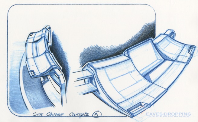
getting better
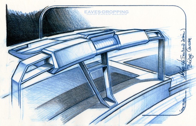
almost there!
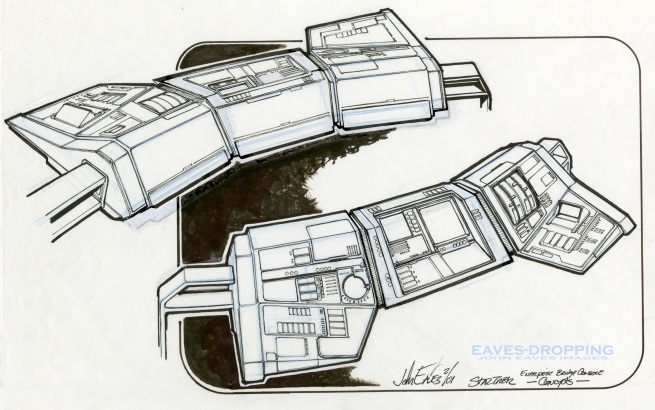
and the final designs!
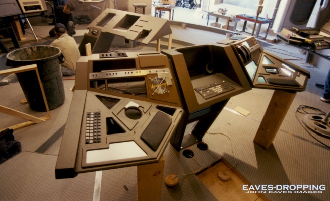
1
2
3
4
5
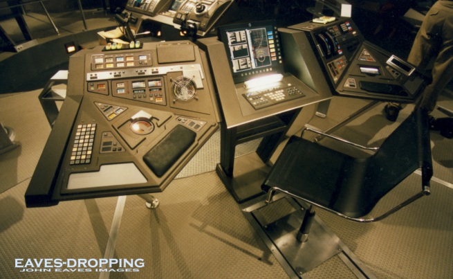
6
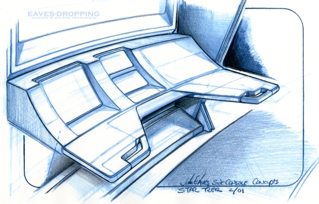
rough wall station
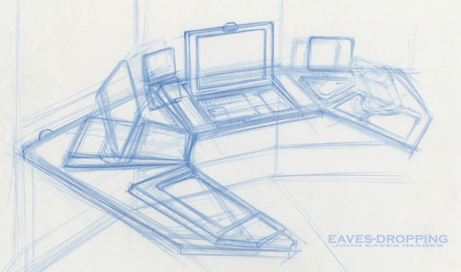
rough 2
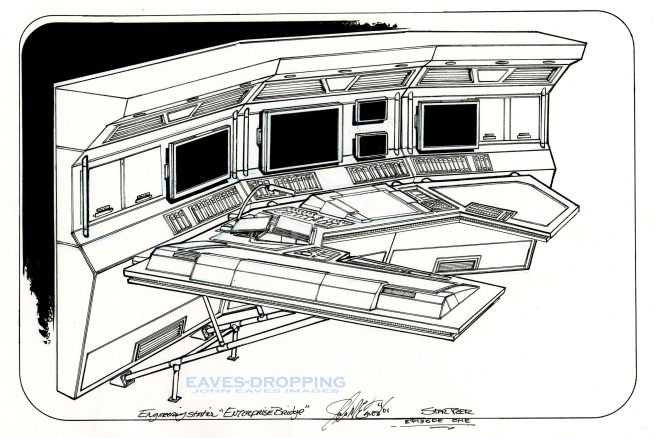
and a final sketch
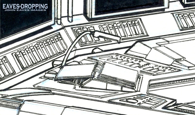
Mike and I had talked about how cool it was to see the operations manual on board the Space shuttle and at the stations of the Navy ships we had been on, and thought it would be cool to have one at all the stations on the bridge of the Enterprise as well. This is the spiral flip book version that later became Mike's hard bound text manual.
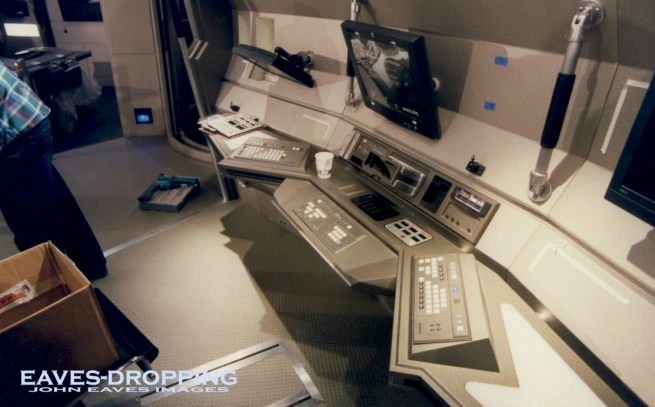
a
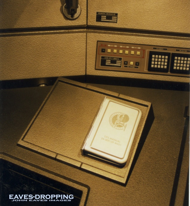
b, operations manual
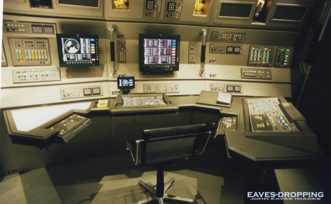
a right hand station, (Hoshi's )
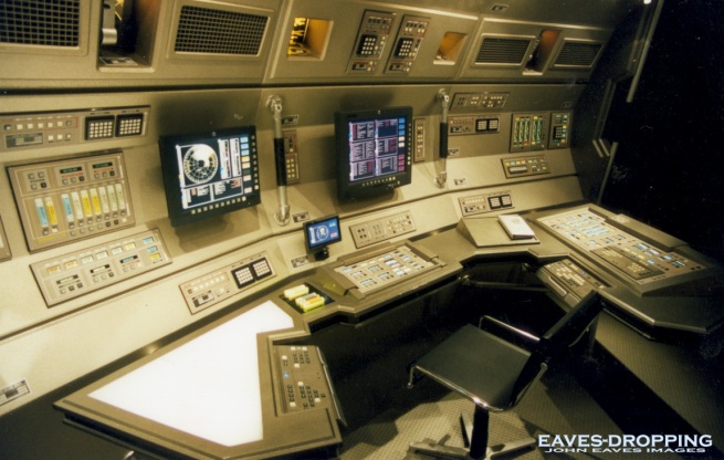
Hoshi's station new view
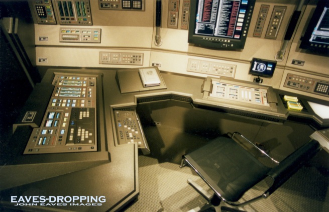
forward left handed station
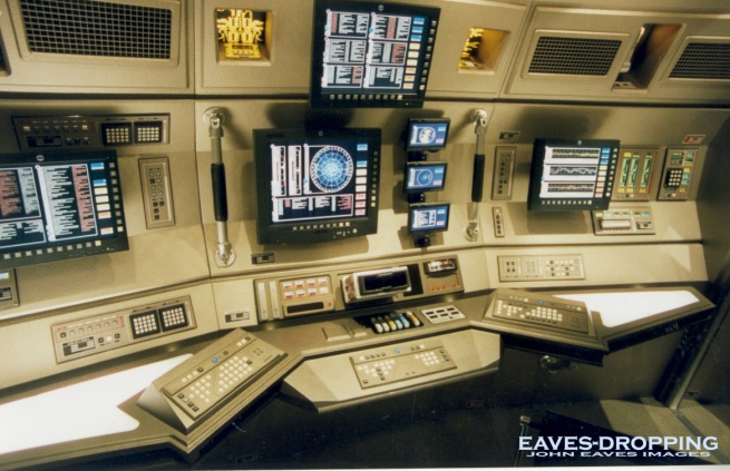
T'Pol's
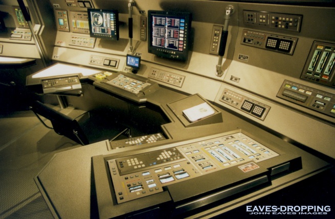
right handed

No comments:
Post a Comment